Advanced Styling
Resources
Fonts: https://fonts.google.com/
Icons: https://react-icons.github.io/react-icons/
Why is Styling so Important?
There's many reasons as to why styling is important, but the three that we're going to be focusing on today is as such:
- catches the attention of your audience
- can help cover up mistakes
- makes your idea seem more realistic
Here we have 2 examples of different websites, showing how much styling can impact a website
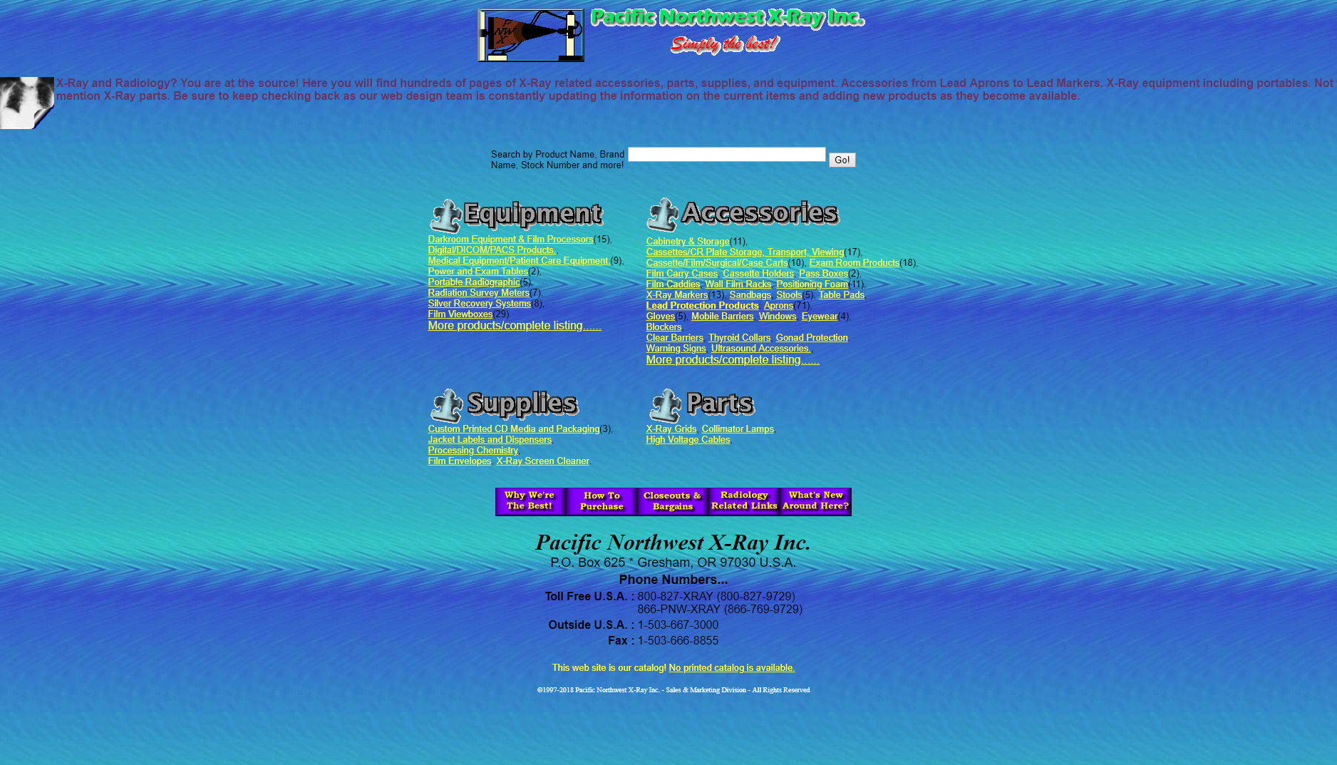
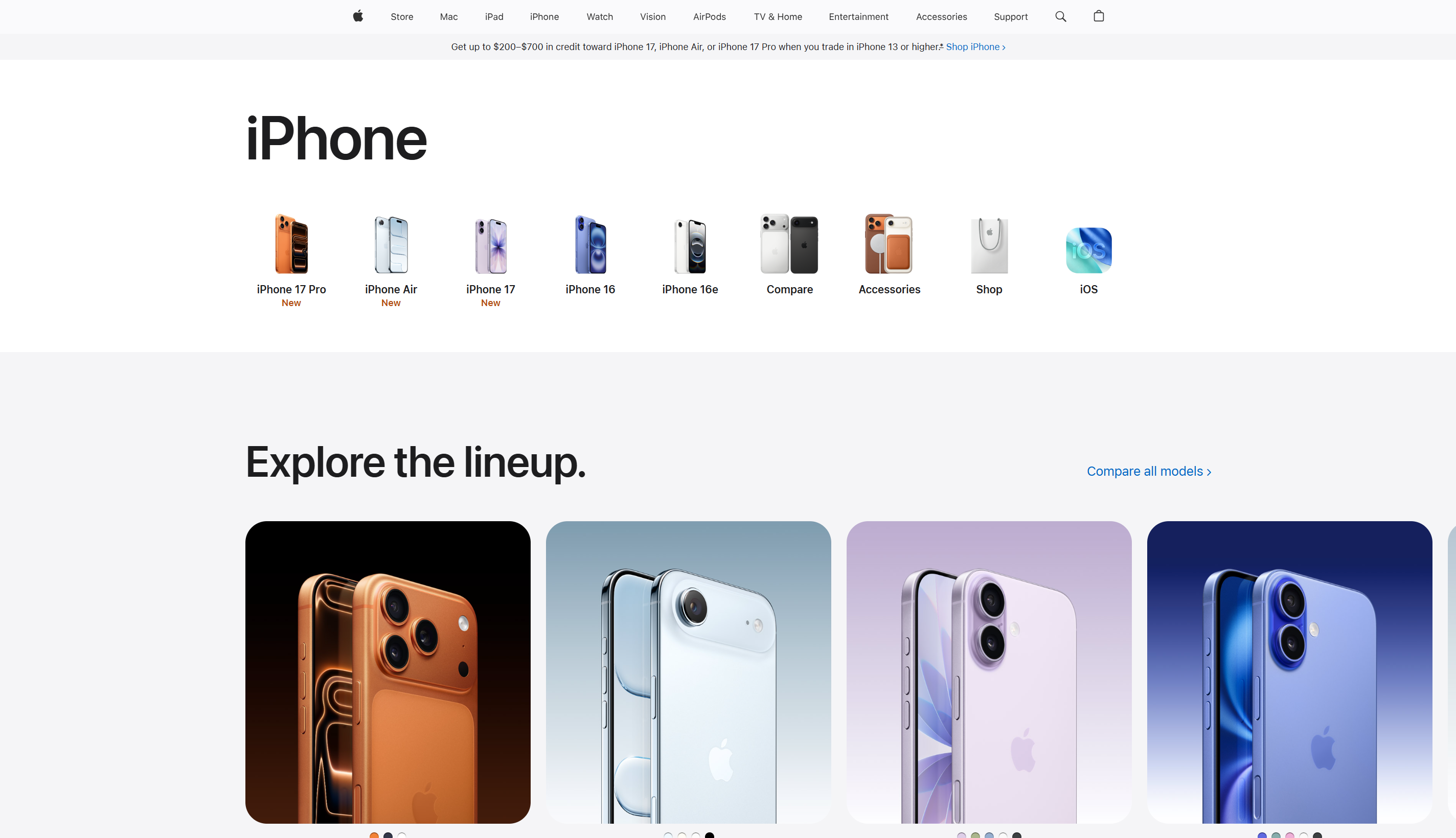
Take note of these major differences!
Apple has a sleek look because it uses high contrast color. Particularly the background color is light and not busy at all.
Apple follows styling standards as buttons are clearly buttons. There is a flow throughout the page.
Where as in the first design there are sections but there is no natural flow. It is hard to read the titles and the bodies of text. The background color is busy, making it harder to read the text.
How Can I Style My Project?
There are many ways to add styling, character, and emphasis to your website. Today we're going over some main points. If you want to learn more you can always go to tailwindCSS documentation for more styling guides.
Element Organization
Flex allows us to organize our elements within a container. By using flex, the default is horizontally in a row.
In this example, the text goes from being in a column to a row for the navbar.

Fonts
Fonts can add a lot of benefit to a website. For titles, it is okay to choose fancier fonts to draw more attention to them. For paragraphs, choose easy to read fonts to make it more accessible.
Bolding, italics, and underlining, are great ways to emphasis specific words or phrases. Make sure to follow styling standards like bolding titles and subtitles or underlining links.
Use utilities like font-sans or font-mono to set the font. A utility is a pre-written CSS class, and here we are using the font family properties.
Find lots of fonts at https://fonts.google.com/
Images
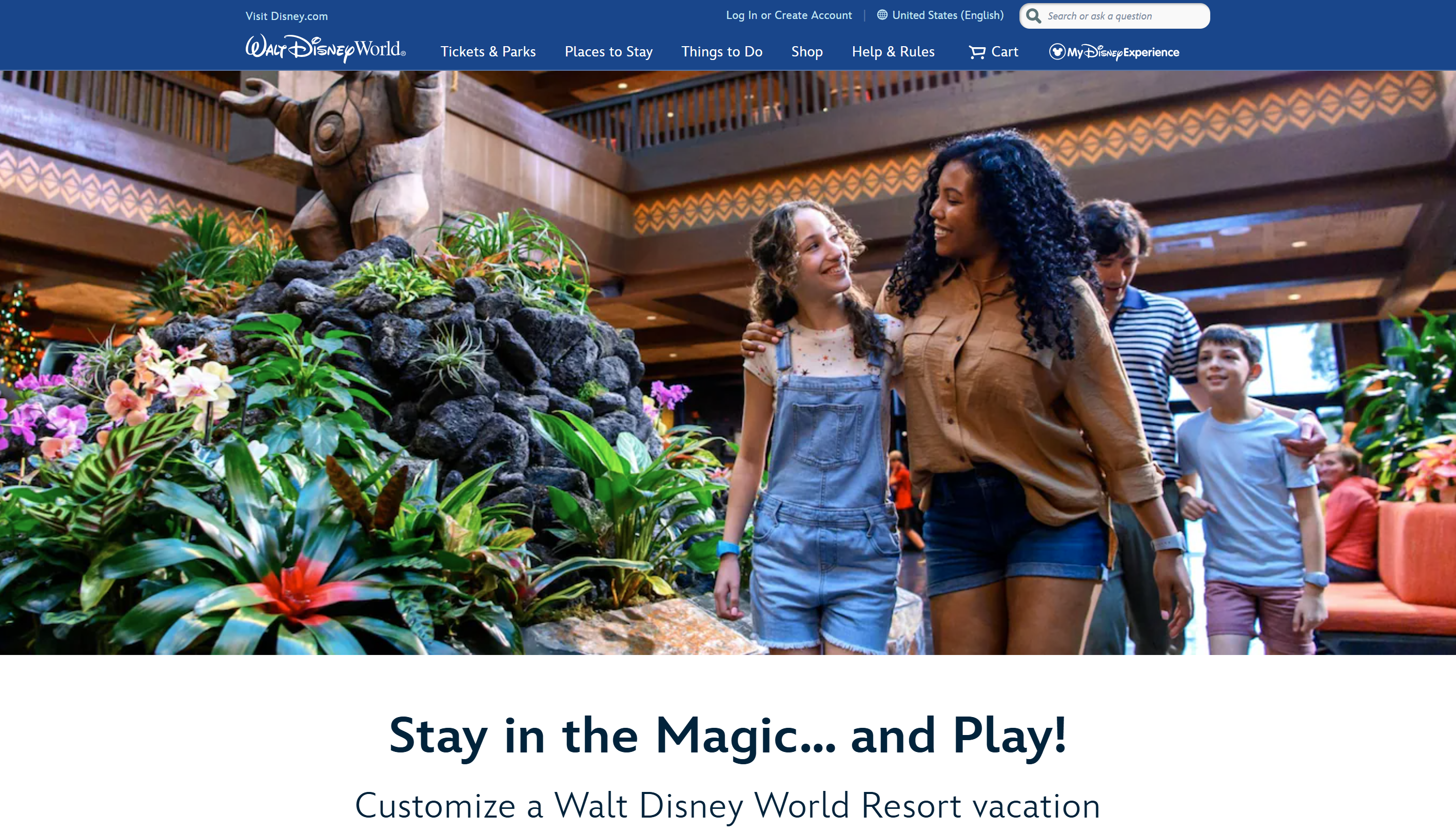
An image conveys 1000 words. They help your audience visualize and convey messages without too many words. Images are also great for logos to create a brand.
We see this with Disney. The image conveys a message and emotion that aligns with their brand.
Subtle Effects
Subtle Effects are subtle, but add a lot to the user experience. You can guide users to what you want them to see and create layers (foreground and background). Using effects effectively will take your website to the next level.
- buttons changing color when hovering
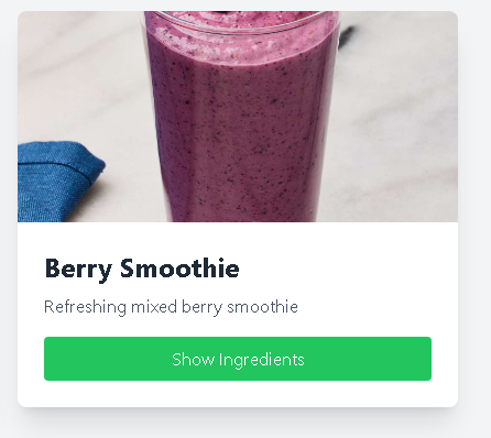
- Card components being distinct from the background create layers
In this example, the card is boxed and creates different layers. Drawing your eyes to the card (foreground).
Continuity
Continuity is about making it easy for the user to use your site. Follow styling standards like using a house icon to go home.
You can find icons at https://react-icons.github.io/react-icons/
Use cohesive colors that match your brand / message, and use these colors throughout your website.
Be sure to section and group like items together to create uniform sections.
Color Palettes
Color palettes give your website character and a cohesiveness that is appealing to users. It is recommended to use 3 colors:
- 60% background color
- 30% main color for buttons and other features
- 10% accent color
You can explore color palettes at https://colorhunt.co/
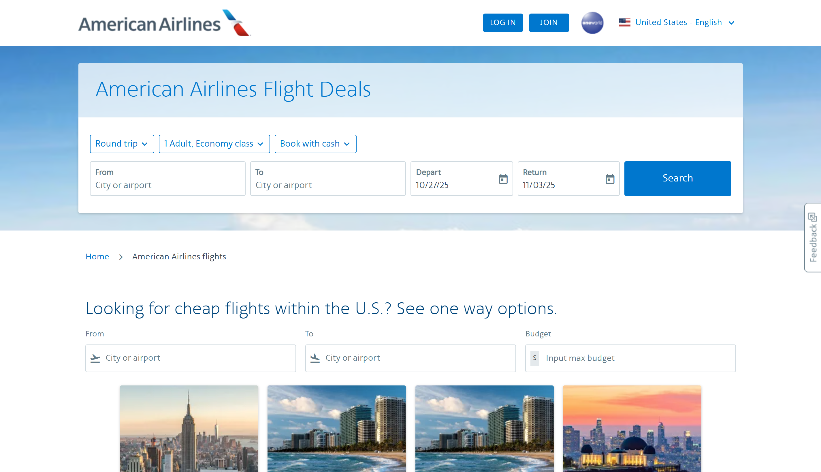
The AmericanAirlines website is a great examples of a cohesive color palette, making the website look professional and draws your eyes to different parts of the page.
Demo Time!
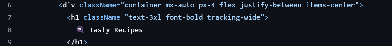
Header.jsx
Step 1: Header
Starting in the Header.jsx file on line 5, after return (. We are going to add styling to the header container.
This adds dimension and emphasis to the container!
Gradient:
- set the direction of the gradient
bg-gradient-to-r - set the colors of the gradient
from-blue-500to-purple-600
Color: set the text color to white
Shadow: set the size of the objects shadow to medium

Step 2: Center
Here we are going to be adjusting the position of the div contents - the <h1> and <nav> tags.
In the first div, add flex justify-between items-center
This will center everything in the div container with even spacing between them. Justify-[] determines how items are placed along the x-axis. Items-[] determines how items are placed along the y-axis.
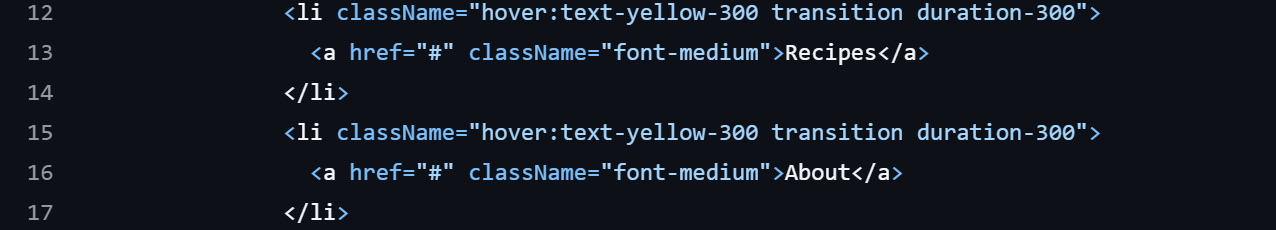
Step 3: Spacing
In the <ul> tag, add flex space-x-4, this adds padding between the containers
If needed, you can also use space-y-[] to add padding along the y-axis

Step 4: Hover
On both <li> tags add hover: text-yellow-300 and transition duration-300
Hover: used to change the styling when the cursor is over the container
Hovers are useful to emphasize buttons and links.
Transition Duration: sets time it takes to change color/style
The duration is important to ensure that transitions are smooth.
RecipeCard.jsx
Step 5: Overflow/Hover
Line 8
Go to Line 8, this is the first line after return (
- add
overflow-hidden- this hides any part of the image that goes beyond the container
- add
transform transition duration-300- this sets the duration of transition
- add
hover: scale-105hover: shadow-xl- this changes the scale and shadow of the image with the cursor is hovering over the object

Step 6: Object Cover
Line 9
- add
object-cover - This set the sizing of an image to cover its container. Maintaining aspect ratio, but it might be cropped.

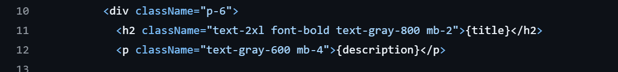
Step 7: Font
Line 11
- add
font-bold text-gray-800, this changes font to bold and gray - add
mb-2, this adds a margin to the bottom of the container
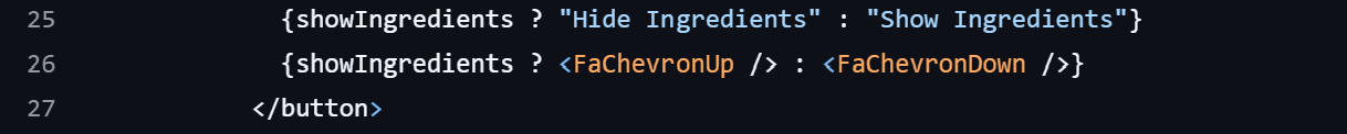
Step 8: Icons
Icons give us a different way to make buttons or add designs to a website.
Above the button's closing tag,
- Add
<FaChevronUp/>and<FaChevronDown />- These are the tags to use the icons imported at the top of the program
- There are many different icons you can import using react-icons
Additional Resources
Tailwind Docs: https://v3.tailwindcss.com/docs/installation
Fonts: https://fonts.google.com/
Colors: https://colorhunt.co/